Contents:
- Composing Mobile-Friendly Email Content.
- Keeping the content concise.
- Subject-line & keeping its length in check.
- Attention-grabbing pre-headers.
- Personalize all emails.
- Use a responsive design.
- Optimize your email with CTAs.
- Add an "unsubscribe" button.
- Use deep linking to enhance the experience.
- Your design should be put through an A/B test.
For the majority of us, as soon as we wake-up, we roll over and reach out to our iPhone or Android phones before getting out of bed. After we freshen up, while eating breakfast or waiting in a line for a coffee on our way to work, we check it again. On weekday mornings, we check our phones at least three to four times before we actually turn on our laptops or desktop. This indeed has become a routine for most of us.
As per latest research by Statistica, over 376.4 billion emails will be sent and received per day by 2025. The usage of smartphones is sky-rocketing and so are the number of people checking their emails on their mobile devices first. In fact, as per OptinMonster, over 58% of adults check their emails first thing in the morning on mobile devices.
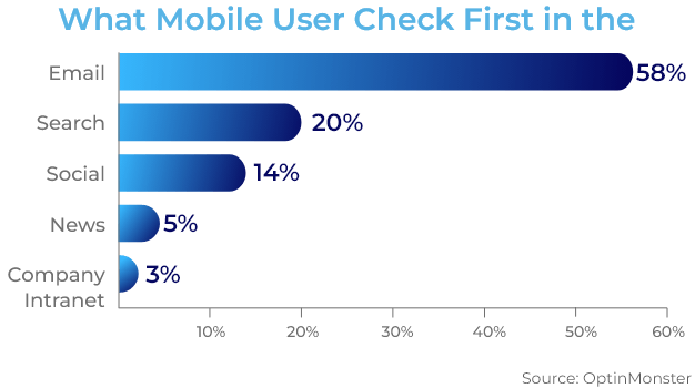
This clearly indicates that emails need to be mobile friendly. Which means that the email needs to display optimally on mobile devices along with desktops or laptops regardless of the device on which the subscriber reads it.
Here are some tips from our SendClean email users that can help optimize your emails for a better mobile experience.
1. Composing Mobile-Friendly Email Content
According to recent reports by Statista, there are over 6bn smartphone users globally, and this means 83.72% of the world's population owns a smartphone. It is critical to ensure a mobile-friendly viewing experience to achieve a higher open rate. A well-drafted email coupled with simplified content and relevant images are some best practices to catch users’ attention.
One of the best industry practices is the UTM or Urchin Tracking Module, a simple code that can be attached to any URL to generate Google Analytics data for your email campaigns. UTM allows you to follow the progress of a campaign across all internet platforms.
2. Keeping the content concise
It is important to have a concise and clear message for any email campaign. The recipient doesn't have leisure time to deep dive into the email. The email draft should have the information that piques their interest without getting into unnecessary details. It is a great way to show the recipient that your brand values their time which inturn helps you to improve the email subscribers’ attention span.
3. Subject-line & keeping its length in check
The first thing anyone reads is the ‘email subject line’. The 60 characters displayed on an email subject line is supposed to pique the interest of the recipients. It should capture their attention so they want to open your email and continue reading.
This is how a subject line appears in your inbox.
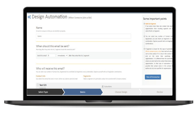
Before you go optimizing your subject lines for mobile, though, it’s good to have a basic understanding of what percentage of your subscribers will open your email on a mobile phone vs. tablet vs. desktop, so you determine the best subject line length.
Characteristics of a great subject line- Less is more: Few words can grab the attention of the recipient
- What is in it for me: Subject line that offers value have higher chances of being opened
- Customized headers: Headers with the recipient's name have better chances of grabbing the attention
4. Attention-grabbing pre-headers
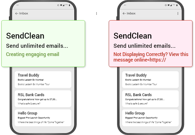
The email preheader gives a preview of what the email is about, similar to the meta description of a web page. It’s the second thing recipients see. Customizing the pre-header is always a good practice as it allows the recipient to understand what can they expect to read in the email once they open it
Rather than rewriting the first sentence of your email, you can customize the pre-header to provide an inside look into what your recipients are about to read in your message.
This is how a subject line appears in your inbox.
5. Personalize all emails
A personalized email tailored to the recipients
When you customize an email and tailor it to your recipient’s preference, it'll feel more thoughtful, professional, and personalized. Email personalization is a great way to humanize your brand. This helps foster a relationship between your business and email recipients and boost retention rates.
6. Use a responsive design.
The real-estate on the mobile screen is very valuable, so keeping the design clean and concise focused on the essential. Email designs that are attention-grabbing, aesthetically-pleasing have great chances of being read and responded to.

A responsive design changes format to adapt itself to the recipient's viewing screen, whether it's on a desktop, laptop, or mobile device. This allows the recipient to view and read the emails with ease no matter the device they are viewing it on. You'll be able to boost UX and email retention across all devices by using a responsive design.
7. Optimize your email with CTAs.
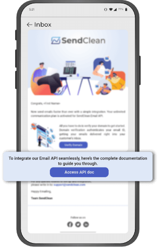
CTAs (calls-to-action) are used to get your email recipients to take action. You can use a CTA to encourage recipients to follow you on social media, visit your website, interact with a sales representative, or become paying clients, for example.
CTAs should be prominent, appealing, and explain why they're important to click. Additionally, you may choose to customize your CTAs so that they are tailored to specific recipients - this strategy has been shown to boost conversions.
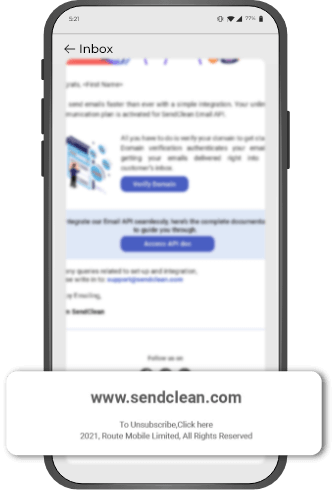
8. Add an "unsubscribe" button.
Email marketing is extremely effective as long as you provide your recipients with relevant content. The unfortunate but true reality of email marketing is that your recipients and customers change over time, particularly as your company grows and evolves. As a result, your content may not always be relevant to certain members of your audience.
Allow your recipients to leave (or unsubscribe from your emails) on a positive note so they remember your company positively — who knows, they might need your email content, products, or services again in the future. To accomplish this, provide an easy-to-use and visible "unsubscribe" button.
In addition to providing a better user experience, you are required by law to include an unsubscribe button.
The Federal Trade Commission and the CAN-SPAM Act require you to include a "clear and conspicuous explanation of how the recipient can opt-out of receiving emails from you in the future." That is, there is no unsubscribe button.
9. Use deep linking to enhance the experience
Adding deep links to emails allows you to link from an email to a specified location in your app (and in a web browser otherwise). This ensures that your message channels and your mobile app, whether Android or iOS, provide a consistent user experience. An e-commerce company, for example, can send a message to their audience about a new featured collection and connect them to that product section in the app. Directing your audience to the appropriate location improves the user experience, conversion rates, and app engagement.
You'll notice new changes, such as deep-linking if you start targeting mobile email opens. When readers open your email on a mobile device, they can use a deep link to go straight to your app.
Deep links in mobile emails can entice users to download your app directly.
You can help lapsed users navigate the app and point them to essential features they may have missed if you're seeking to increase engagement or persuade them to return.
10. Your design should be put through an A/B test.
Email design, like most marketing endeavors, is an iterative process. To get the most out of your email design, you may need to make some modifications and tweaks
Don't be hesitant to A/B test designs to see which one performs best in terms of capacity to reach, resonate with, and convert the most people, whether it's changing your CTA, colors, graphics, layout, or tone.

Clearly, writing mobile-friendly emails is easy. It's a multi-step process to ensure that your emails get read and that their connection with your campaigns is fruitful rather than unpleasant for mobile customers on the go. Check out SendClean if you need help setting them up or want to modify your current campaigns.
